
Sports Venue Flooring Color Matching Guide: How to Balance Aesthetics and Functionality?
Sports Venue Flooring Color Matching Guide: How to Balance Aesthetics and Functionality?
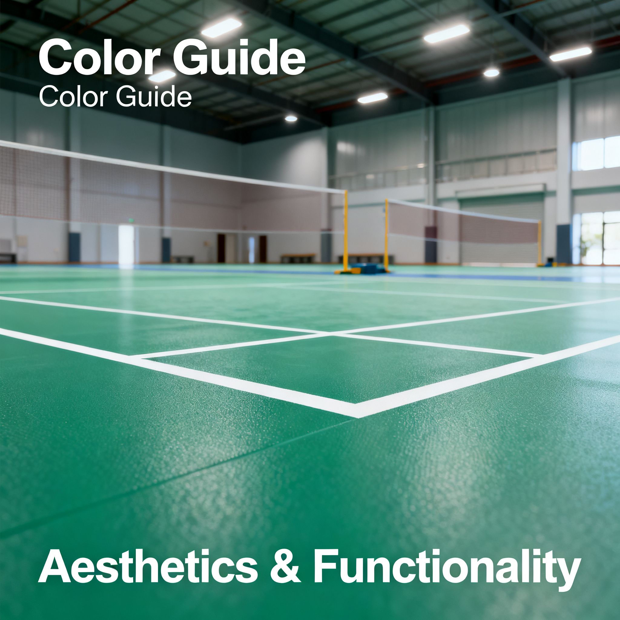
When you walk into a newly opened badminton hall, what catches your eye first? Is it the brightness of the lights, the spaciousness of the courts, or... the color beneath your feet?
Many people assume that flooring color is purely an aesthetic concern—just pick a dark shade that hides dirt and call it a day. But in reality, the color scheme of sports flooring directly impacts your athletic performance, visual comfort, and even injury risk. Today, let's dive into how to choose the right colors for sports venue flooring.
How Does Color Affect Your Athletic Performance?
Let's start with a real-world observation. If you've played on a blue court and then switched to a red one, you'll notice subtle differences in judging ball trajectory and perceiving landing spots. This isn't psychological—it's backed by science.
Blue Tones: The "Competitive Color" for Calm Focus
Blue is a cool tone that helps stabilize heart rate, allowing athletes to stay composed during high-pressure matches. For sports requiring quick reactions and precise judgment, like table tennis and badminton, blue flooring reduces visual fatigue and makes white shuttlecocks or yellow balls stand out more against the background. This is why blue tones dominate international competition venues.
Green Tones: The "Endurance Color" for Eye Comfort
Green sits at the center of the visible light spectrum, making it the easiest color on the eyes. Extended exercise in green environments relaxes the ciliary muscles, reducing dryness and fatigue. For longer-duration sports like basketball and dance, green flooring keeps you comfortable during prolonged training sessions.
Red/Orange Tones: The "Energy Color" for Passion and Vitality
Warm tones stimulate adrenaline production, boosting excitement. Fitness studios and spinning rooms often use red-orange schemes to energize the atmosphere. However, overly vivid reds can trigger irritability if stared at for too long, so it's best to use them in medium-to-low saturation combinations.
Gray Tones: The "Professional Color" for Versatile Elegance
Gray has become a favorite in modern venue design. It's dirt-resistant, exudes sophistication, and doesn't interfere with ball tracking. Many professional training facilities opt for light-dark gray combinations, balancing professionalism with aesthetic appeal.
Mainstream Court Color Schemes: Which One Fits You?
Option 1: Single-Color Coverage—Classic and Foolproof
The entire court uses one color, such as the deep blue or dark green common in table tennis halls. Pros: visual consistency and lower cost, ideal for budget-conscious or smaller venues. Cons: can feel monotonous and may cause visual fatigue over time.
Option 2: Two-Color Zoning—Function Meets Aesthetics
The playing area uses one color (e.g., blue), while the surrounding buffer zone uses another (e.g., gray or light green). This design maintains focus during play while using color contrast to help athletes clearly perceive court boundaries, reducing out-of-bounds errors. Many professional-grade venues adopt this approach.
Option 3: Three-Color Patterning—Premium Customization
Building on the two-color scheme, a third color is added for decorative lines or logo areas. For example, a badminton court might use blue as the base, green for sidelines, and yellow to outline service lines, creating clear layering and striking visuals. This option suits commercial venues looking to elevate their brand image.
Don't Forget Texture: The "Chemical Reaction" Between Color and Slip Resistance
Once you've chosen colors, texture is equally crucial. The surface patterns on flooring (e.g., lychee, diamond, or sand textures) not only affect friction but also alter how colors appear.
Smooth textures reflect more light, making colors look brighter and more vivid, but excessive glare can be harsh. Fine matte textures soften light, giving colors a more subdued look while providing stable grip. When selecting, observe the flooring's color under both natural and artificial lighting to avoid significant color discrepancies after installation.
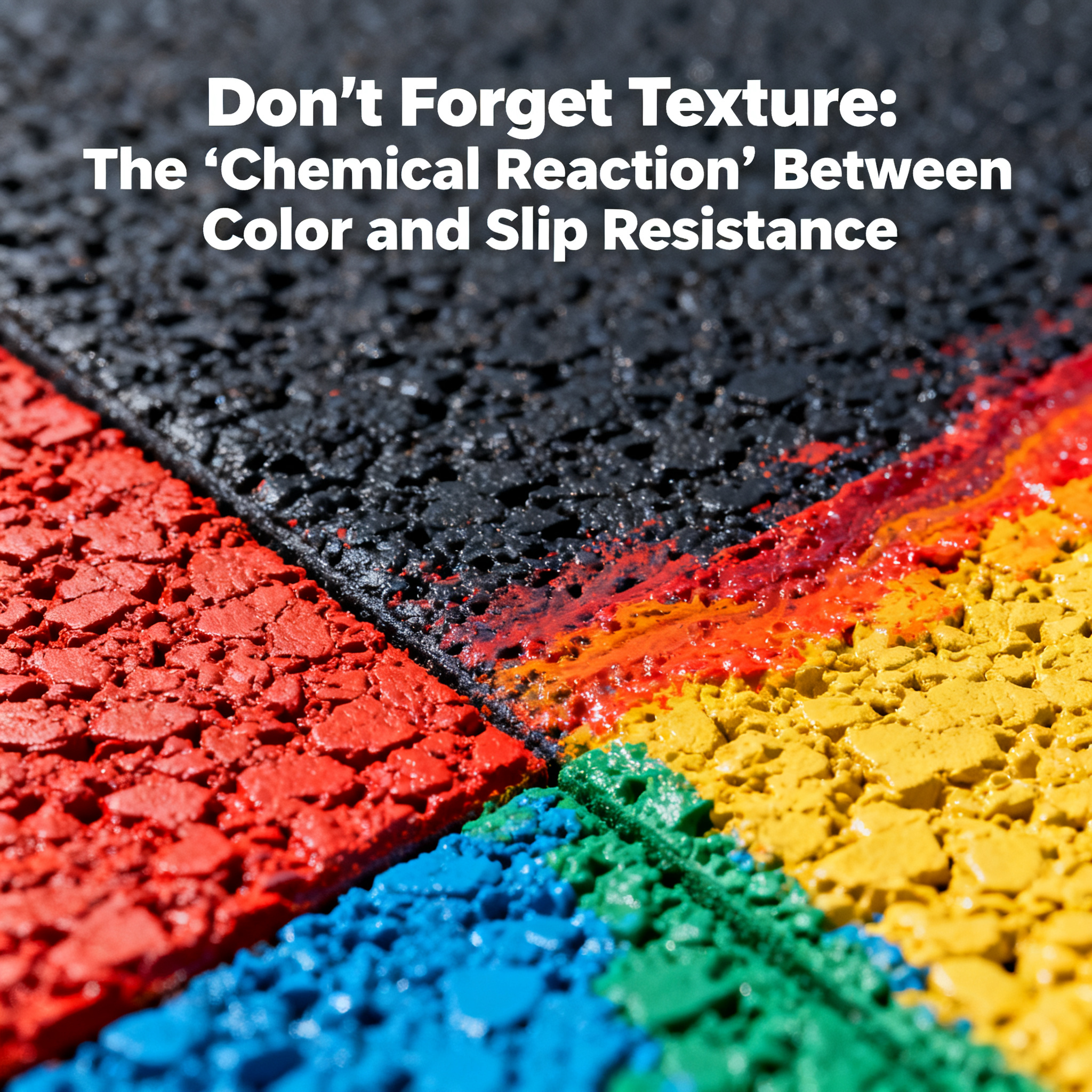
Additionally, light-colored flooring shows dirt more easily than dark shades, requiring more frequent cleaning. For high-traffic venues, dark tones or light colors with granular textures are more practical choices.
A Case Worth Referencing
Recently, I visited a company's self-built table tennis activity room, which used SQUARE COMFORT's blue-gray two-tone PVC flooring. The playing area featured a medium-saturation blue, with gray buffer zones around the tables, creating a clean, crisp look. The facility manager noted they chose this scheme because blue helps employees quickly get into the zone during lunchtime matches, while the gray areas are dirt-resistant and easy to maintain. This approach, balancing functionality and operational needs, is worth considering for anyone planning a venue renovation.
Final Thoughts
The color of sports flooring is never just about looking good. It affects every jump, every sudden stop, and every precise judgment you make. Choose the right colors, and your venue's aesthetics and functionality will both shine; choose poorly, and users may feel discomfort, compromising their overall experience.
If you're planning a new venue or renovating your floors, start by considering the characteristics of your sport, then factor in lighting conditions and maintenance capabilities to finalize a color scheme. SQUARE COMFORT, a brand with years of expertise in sports flooring materials, offers end-to-end services from design consultation to construction acceptance, having benefited over 10,000 clients worldwide with their court flooring solutions. Let professionals guide you—it's both convenient and reassuring.
After all, every great athletic performance begins with the color beneath your feet.